5 things you should NEVER do when you Create Print Advertising

Some people have been known to say print advertising is dead… but here at Absolute Creative we know that’s definitely not the case. We still design and create highly successful print ads for businesses all over the UK. However, if you want your ads to be successful, there are certain things you should do, and certain things you should never do if you want your print advertising to work. We don’t like telling anyone what to do, so this blog focuses on those print ad no-no’s – pay attention and you won’t make the same mistake many others have, and still do.

1. Don’t use a wishy-washy headline. Just like a blog post, newspaper article, or magazine feature, the headline is the first thing your reader will see – and it’s very likely to be the one thing that makes them decide whether or not to read the rest of the ad. You need a headline with impact, or your whole ad will be wasted

2. Don’t use too much copy. If your ad is ‘word heavy’ it will put people off and they won’t bother with it. Yes, you’ve probably got a lot to say, but less is often more so keep your sentences short and snappy, and focus on the important stuff – the benefits to your customer

3. It’s not all about you. We like talking about ourselves, don’t we? And we’re excited about our new ‘thing’ we’re selling. Nobody else cares though – sad but true – so don’t lay it on too thick about all the fantastic features and focus on how it’s going to solve a problem for the reader. That’s what sells.

4. Don’t be confusing. If you have 2 or 3 things to sell, make 2 or 3 ads. DON’T attempt to get them all in the one ad to save money, you’ll just confuse the customer and they won’t buy any of them. Make one good ad for each product, and focus on the main benefit of each.

5. Don’t make them guess what to do next. A strong call to action is important, so make sure your ad lets them know what they have to do next to either buy, call for info, learn more, book, or whatever it is you want them to do. Say it clearly and make it very visible or you’ll miss out on sales.

Do you need print advertising? We are Absolute Creative, an award-winning design agency, and we can help. We’re based in Hertfordshire but our customers come from all across the UK because we create print ads for you that work. Call us today on 01707 386 107, or email hello@absolutecreative.co.uk to learn more about what we can do for your business.

Where do I find the best images for my website and flyers?

When you start a new business, and even when you’ve been in business for a while, you’ll need some high-quality images. These will be for your website, flyers, product brochures, and other marketing materials. Many business owners get these images from stock image sites, of which there are many online. For a reasonably low cost, you’ll usually be able to find some decent images that suit your needs. However, they’re images that are not unique to your business and your marketing, so you may see them elsewhere – and so might your customers. A good example of this is the online customer service image of an attractive young lady in a headset – you know the one we mean – she’s ready to take your call and solve your problems with a click of your mouse.

So, the main issue with stock images is that they’re not really authentic. They can be kind of boring, and they don’t truly represent your business, do they? Wouldn’t it be better to have real images of real people – the people who work for you, and who your clients (if you run a local business) may know by sight? Imagine if instead of stock photographs you could have images of your own products, your sales team, your customer service team, your business premises, your projects, you, the dog…

That sounds better, doesn’t it?

Don’t be tempted to take them yourself though. Yes, your new Huawei phone may have a great camera, but we all know it’s not just the camera that takes the photographs. Using a good professional photographer for your marketing images will be a sound investment in your business. There’d be no more generic stock pics you can find anywhere on the web – just your own portfolio of quality bespoke images. Your website and marketing materials would be truly unique, authentic, and represent your business as it really is.

If you need a photographer, a website or marketing materials for your business, we can help you. We’re Absolute Creative, an award-winning design agency based in Hertfordshire. We work with businesses like yours all over the UK, designing websites, flyers, brochures, and other marketing materials including vehicle graphics. We always make sure your business stands out from the crowd. Call us today on 01707 386 107, or email hello@absolutecreative.co.uk and let’s chat.

3 Top Tips to Get the Most from Your Flyer Advertising!

Whether you’re attending a trade show, promoting an event, letting people know about your special offer, or launching your brand-new local business, flyers are a great way to do it. However, there are some top tips you should know before you start designing and handing out your own flyers. Without these you may just be wasting your cash.

1. Don’t waste the headline!

As with any advertising copy, the headline is the most important bit of the ad. Without a headline that grabs the readers attention, they won’t go on to read the rest of your flyer. It doesn’t matter how pretty it is, or how lovely your logo looks, or how proud you are of your business name – they don’t care about any of that. The reader wants to know if you can solve their problem, so that’s what your headline should be telling them.

2. Tell them what to do!

You need to take the hand of your reader and show them what they need to do. That means including at least one call to action, and maybe more depending on how much copy there is. Different people have different personality types. Some like lots of info and plenty of details, while others are more decisive and willing to take risks. You may have your big headline at the top ‘We’ll make your lawn look amazing all summer, giving you the time to do the things you really want to do’ with a call to action right underneath ‘call right now to learn more and get 15% off for the whole season’. Under that you can write the details – who you are, what you do for people, all the benefits your service provides, some testimonials – then repeat the call to action again at the bottom for those who like all the info before they make a decision.

3. Design and use two different flyers

This may seem like extra expense, but getting two different flyers designed and printed so you can test one against the other makes perfect business sense. This has been done since direct mail ads were invented – check the old advertising greats such as David Ogilvy and John Caples and you’ll see it’s the testing that made them successful. It’s still done on the internet by the successful marketers, and you should do it too. Knowing what makes your customers buy will be worth a fortune to you in the future.

If you’re looking to have some flyers designed, we can help you. We are Absolute Creative, an award-winning design agency based in Hertfordshire but working with businesses like yours all over the UK. We design and print flyers that capture attention and make your business stand out. Just so you know, we also design websites, vehicle graphics, and a whole lot more. Call us today on 01707 386 107, or email hello@absolutecreative.co.uk and we’ll create some flyers you’ll be proud to hand out.

5 Things You Must Always Do with Your Business Card

Everyone in business has a business card, right? After your domain name its probably the first marketing tool you bought when you started your business. However, as you probably know from the ones you’ve been given by other people at networking meetings, they are often fast-tracked to the bin when we get home or back to the office. That’s a shame – we’ve spent money on them after all – so what can we do to make our next business card as effective as possible and not instant bin fodder?

1. Get them in matt finish

Why? I hear you ask. Well the answer is a simple one and not what you might be thinking. The most successful networker this blog writer knows ALWAYS writes something on his card before he passes it to a potential client or referral partner. It’s often just ‘thank you’ with his name, but it’s a nice gesture and it not only makes people remember him, it encourages people to keep the card. Why matt though? Well if you’ve ever tried to write in biro on a gloss card you’ll know!

2. Make sure they show your branding

Start with your logo, then use that to create consistent designs across all your marketing materials. Unless you have a background in design, don’t try and save a few quid by doing it yourself or using a cheap online site. You’ll only regret it later. Find a good professional graphic design company, tell them about your business, your goals, your vision and values, and pay them that little bit extra to do what they do best. Then you can use their designs to promote what you do best.

3. Use both sides

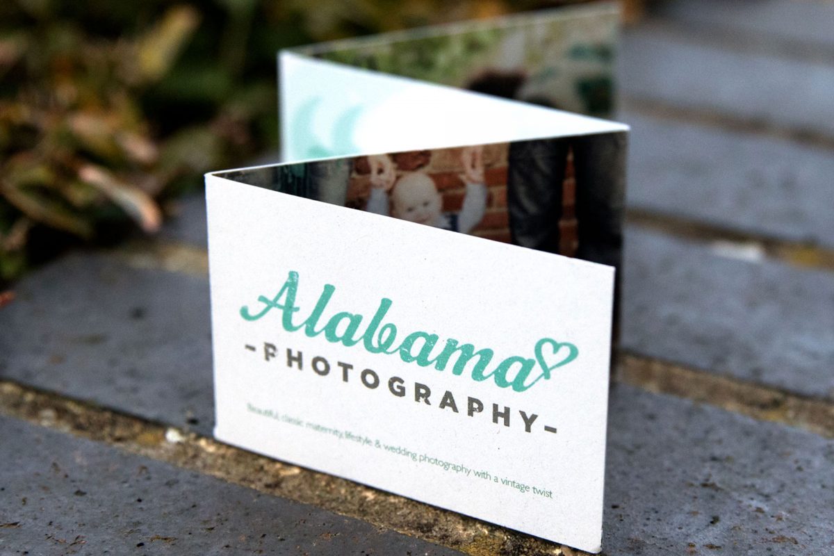
Blank space on one side of a business card is a missed opportunity. For the pennies extra it costs you to have both sides printed it’s a no-brainer. You could have some of your services on there, your mission statement, or a product image. If you need to book appointments (solicitor, hairdresser for example) you can utilise the back as an appointment card.

4. Don’t overdo it

Keep the card simple(ish) by not adding too much text. Tell people what they need to know – your name, telephone, email address – show your logo and tagline, but making it too busy can mean it’s difficult to read and possibly off putting for the recipient. The same goes for colours too. Think of how you want to be perceived by others.

5. Make it memorable

This is where design skills come in again. There are so many design & print options available now, making your card stand out has never been easier. We’ve seen cards in the shape of pigs, bottles, and cars, cards with cut-outs, pop-ups, and a myriad of textures. As mentioned before, don’t go overboard. It’s great to be different, but you don’t want to be tacky. Think of your target market too – if you’re an eco-friendly business you may want to go with a card made from recycled materials.

If you need business cards, we can help – whether it’s for a new business, an existing business, or a re-brand. We are Absolute Creative, an innovative, award winning design agency based in Hertfordshire. We work with businesses like yours everywhere in the UK, creating business cards that make our clients stand out from the crowd. We can do a whole lot more than that of course, so why not call us today on 01707 386 107, or email hello@absolutecreative.co.uk and let’s discuss your new and improved business card design.

Print Advertising Isn’t Dead

Do your marketing efforts focus on having a sleek and streamlined digital presence? Then you’re doing it wrong. There’s nothing wrong with having a website which matches your social media and other online endeavours. Putting resources into having a unified image is what we’re all about. The issue is when a company invests too much time and money into online advertising.  

According to INMA, ‘ 82% of U.S. internet users trust print advertising when making a purchase decision, more than any other medium’. This is a significant statistic, considering only 61% trust search ads. If your advertising budget has no room for print ads, it might be time to reconsider your marketing spending.

Cool vs. Predictable


In this digital age, advertisers often get addicted to being cool. They attempt to wow the audience rather than keep them hooked. As much as we pretend it’s not true, our attention spans are decreasing. As soon as we see another cool thing, we’ve forgotten whatever we saw previously. Holding the attention of an audience is so tricky to achieve online, as it’s so simple to click away.

Print marketing has and always will be predictable. Unlike digital methods, readers know exactly what’s coming next. An online publication bombards you with information, internal and external links, sources, flashy adverts and more. When reading something as complex as a magazine, the audience knows what’s coming. This compels them to keep turning the pages. Being simple and predictable isn’t a bad thing when it comes to print, as it will keep your audience coming back for more.

Keeping it simple will also increase the chances of your message being remembered, as it’s not obscured by a noisy website. A page with just your content on will hold the attention of a viewer. A webpage with other distractions on it will take away from this experience.

Satisfaction


Once you’ve got your audience hooked, it’s easier to show them more content. Your digital content should answer questions that your audience want answering instantly. We search for answers via Google, and we’re satisfied with a sentence, a paragraph or an article. Rarely do we seek out different content from the same source if we’ve been satisfied already.

Print advertising changes that. By picking up a brochure, magazine, newsletter or leaflet, we expect answers to questions we didn’t know we had. The satisfaction comes from reaching the end of a piece of content, and it’s easy to turn the page for more. This is a great way to drive home your company message and deliver more great content to your audience.

Occupy space and thoughts


By having a physical copy of your content, you allow your brand to occupy both the space and thoughts of your audience. Information we see online is easily forgotten or misattributed and can be a noisy experience for the reader which adds to the confusion.

A copy of your magazine on a desk at work could spark a conversation. A supermarket newsletter sat on the kitchen counter serves as a reminder that your store exists. Often, your customers will associate having a heavy, glossy brochure or a nice-feeling matte catalogue with luxury and quality. Occupying the space of your audience allows you to occupy their thoughts, as opposed to a quickly forgotten website.

Even if your ad or flyer is unwanted, your audience will still be thinking about it as they fish it out the bottom of their bags to throw away.

Stand out


Having a physical version of your content will help you stand out, as well as benefit you in all the ways listed here. Whether you produce a simple business card or a magazine, you won’t be fighting for space online with hundreds of other people like you. Placing your physical copies somewhere like coffee shops, supermarket notice boards or in-store is a guarantee that people will see you. There’s no guarantee that people looking online will see your links, much less click on them.

It also makes you memorable as people take time out of their day to hold and take in the information you’re providing, without extra adverts and moving graphics. It’s a ‘safe’ way to get information, as there’s no threat of malicious links or having your data stolen.

Print ads also allow for a higher level of emotional response, as you can directly interact with what’s on the page by holding what you’re seeing. A great example of this is when IKEA produced lavender scented, white-noise emitting print ads. To advertise their mattresses in the UAE, they conducted research into how much sleep people were getting. They found that 9 in 10 people are getting less than 8 hours sleep a night, so they produced a resource targeted to them. This revolutionary new ad hit the headlines worldwide for its out of the box thinking, and rightly so.

While not all of us have the resources to produce such a complex ad, the principle applies. Print allows for a wide range of designs that the internet doesn’t. There’s no online equal to the IKEA ad, simply because it’s exciting to hold and to have. That, and computers can’t produce scents. Even something as simple as having business cards which are highly customised or an event-specific leaflet is exciting and allows for an emotional response.